Thursday, December 1, 2011

Check this Out!
If you don't recognize this work of art then you can just crawl back under the rock you've been living under for your whole life. Although the Mona Lisa is considered one of the most recognizable works of all time it has also been the center of many theories that add to the allure of the work. The Mona Lisa made news recently here in Rochester, where WHEC 10 reported on a person's discovery of hidden imagery in the masterpiece - check it out here and make sure you watch the video - it's on the right hand side and a little small, but well worth the 5 minutes.

So what do you make of this video? What is your impression?
Investigate other theories behind this work of art and record your findings - you might be surprized what craziness you find.
Happy Friday!
-Denner


Tuesday, November 29, 2011

Technical Tuesday


This video is a great explanation of how to paint with color instead of value. Too often we look at things in black, white, and gray without considering the surroundings or the temperature of these neutrals.  All neutrals have warm or cool characteristics and having an ability to recognize this could be the difference between an image appearing flat or volumetric.
Enjoy the Vid!
-Denner

Monday, November 28, 2011

Monday History
Pablo Picasso
Guernica (1937)
Oil on Canvas, 349 x 766 cm

Guernica is a painting by Pablo Picasso. It was created in response to the bombing of Guernica, Basque Country, by German and Italian warplanes at the behest of the Spanish Nationalist forces, on 26 April 1937, during the Spanish Civil War. The Spanish Republican government commissioned Picasso to create a large mural for the Spanish display at the Paris International Exposition at the 1937 World's Fair in Paris.

Guernica shows the tragedies of war and the suffering it inflicts upon individuals, particularly innocent civilians. This work has gained a monumental status, becoming a perpetual reminder of the tragedies of war, an anti-war symbol, and an embodiment of peace. On completion Guernica was displayed around the world in a brief tour, becoming famous and widely acclaimed. This tour helped bring the Spanish Civil War to the world's attention.

With all thanks to Wikipedia for the above description I would like you to reflect upon this work of art, which many consider to be the most significant piece of the 20th century. What symbols do you see in this work? Search carefully and record your observations - be specific about what you see. How does this work reflect a social issue? What is going on in this composition. Be inquisitive in your investigation and enjoy this quintessential work of art.
Happy Monday!
-Denner

Monday, November 21, 2011

I'm Ba-ack!
Monday History
Reginald Marsh
"Why Not Use the 'L'?" 1930
Tempera on Board

Reginald Marsh (1898 - 1954)
Marsh painted at a time when Modern Art was all over - from Cubism to Abstract Expressionism. He is most known for his paintings of New York City and the Great Depression. Below is a great description of his point of view from Wikipedia:
Reginald Marsh rejected modern art, which he found sterile.[7] Marsh’s style can best be described as social realism. His work depicted the Great Depression and a range of social classes whose division was accentuated by the economic crash. His figures are generally treated as types. "What interested Marsh was not the individuals in a crowd, but the crowd itself ... In their density and picturesqueness, they recall the crowds in the movies of Preston Sturges or Frank Capra".

Marsh’s main attractions were the burlesque stage, the hobos on the Bowery, crowds on city streets and at Coney Island, and women.[5] His deep devotion to the old masters led to his creating works of art in a style that reflects certain artistic traditions, and his work often contained religious metaphors. "It was upon the Baroque masters that Marsh based his own human comedy",[5] inspired by the past but residing in the present. The burlesque queen in the etching Striptease at New Gotham (1935) assumes the classic Venus Pudica pose; elsewhere, "Venuses and Adonises walk the Coney Island beach [and] deposed Christs collapse on the Bowery".[4] The painting Fourteenth Street (1934, in the Museum of Modern Art, New York) depicts a large crowd in front of a theater hall, in a tumbling arrangement that recalls a Last Judgment.
Marsh filled sketchbooks with drawings made on the street, in the subway, or at the beach. Marolyn Cohen calls Marsh's sketchbooks "the foundation of his art. They show a passion for contemporary detail and a desire to retain the whole of his experience".[9] He drew not only figures but costumes, architecture, and locations. He made drawings of posters and advertising signs, the texts of which were copied out along with descriptions of the colors and use of italics.[9] In the early 1930s he took up photography as another means of note taking.

Signage, newspaper headlines, and advertising images are often prominent in Marsh's finished paintings, in which color is used to expressive ends—drab and brown in Bowery scenes; lurid and garish in sideshow scenes.[10]
So my question to you is this: What does the work "Why Not Use the 'L'" suggest?
Don't just assume - investigate! I look forward to your findings. Have a great Thanksgiving and until then, keep those pencils sharp and ideas fresh!
-Denner


Monday, November 14, 2011

Monday History
Post-Impressionism
Study for A Sunday on La Grande Jatte, 1884
Georges Seurat (French, 1859–1891)
Oil on canvas 27 3/4 x 41 in. (70.5 x 104.1 cm)

The Impressionists were mostly concerned with optical impressions, time of day, and space in their work, but what was missing that led to a new movement? EMOTION! EXPRESSION! After all, isn't that what art is all about? Some say so but I'll leave that up to you. To understand the Post Impressionism period in Art History you should get acquainted with the following artists:
Paul Gauguin (1848–1903), Georges Seurat (1859–1891), Vincent van Gogh (1853–1890), and the eldest of the group, Paul Cézanne (1839–1906). Follow these links courtesy of the Metropolitan Museum of Art to learn about these greats!

I refer to Post Impressionism as a time period because unlike artists who participated in art movements, most Post Impressionists worked independently - their work just happened to fit a certain mold that we can categorize with. Georges Seurat was known for his dot style called "Pointilism," a technique that was epitomized by his master work "A Sunday Afternoon on the Island of La Grande Jatte." Follow this link to see the finished work - the image above is just a study to wet your palette.  Look further into the Post Impressionists - there's a little something for everyone here including one of the most famous works of all time - Starry Night by Vincent Van Gogh!
Happy Monday
-Denner

Tuesday, November 8, 2011

Technical Tuesday

Color is something that too many artists use without understanding
The chart above shows variations of yellow based on 3 attributes - Hue, Value, and Intensity (or Chroma).

Hue is the name we give a color - like "Red," "Blue," or "Yellow Orange"
Value is how dark or light the color appears
Intensity/Chroma is how bright or dull the color appears

There are 51 different tints, shades, and tones of yellow visible here - all of which are creating by varying the white, black, and gray balance of the color. The darker the color, the more variations you can achieve...take a moment to consume that info and consider its relevance to your practice as an artist.

Try out a chart like this in your sketchbooks. Choose a color and mix a variety of levels of white, black, and gray and chart the differences then reflect upon how this will impact the way you use color in the future.
Keep those pencils sharp and ideas fresh!
-Denner

Monday, November 7, 2011

Monday History
Haystack, End of Summer 1891
Oil on Canvas, 24" x 40"
Making an Impression

Impressionism is considered by most to be the turning point in Art History - a time that evoked the greatest continual change in art and the constant progression that artists work towards today.

(From Wikipedia) Impressionism was a 19th-century art movement that originated with a group of Paris-based artists whose independent exhibitions brought them to prominence during the 1870s and 1880s. The name of the style is derived from the title of a Claude Monet work, Impression, soleil levant (Impression, Sunrise), which provoked the critic Louis Leroy to coin the term in a satiric review published in the Parisian newspaper Le Charivari.

Characteristics of Impressionist paintings include relatively small, thin, yet visible brush strokes; open composition; emphasis on accurate depiction of light in its changing qualities (often accentuating the effects of the passage of time); common, ordinary subject matter; the inclusion of movement as a crucial element of human perception and experience; and unusual visual angles.
The image above represents one of a huge series of works by Monét called "Haystacks."  
Follow this link to learn more about the series of works and then respond to the following:

1. Why do you think Monét devoted his time to this series
2. Investigate the work of the Impressionists and find another artist from the movement that you like
3. Include a brief bio of the artist, 3 examples of their work, and why you chose the artist


Happy Monday!
-Denner


Friday, November 4, 2011

Check This Out!
Pollination / 2007 / 22 x 34 inches / Oil on canvas


Hardwired / 2008 / 15 x 18 inches / Oil on canvas

Will Wilson is a painter who has a diverse body of work with many interests ranging from illustration to portraits of dignitaries. His strengths include rendering, composition, and concept - all of which he executes at a master level. 

Both pieces shown here demonstrate his ability to paint things with an element of realism, but they also juxtapose the imagery to add meaning to the piece. 

What is your impression of these pieces? What is the message behind the work? Check out his gallery to see more of what he does.
So what are you waiting for? Check it out!
Happy Friday,
Denner


Tuesday, October 25, 2011

Technical Tuesday
Alexa Meade
Blueprint

Just when you think we've run out of ideas something like this comes around. What we have here is something that appears to be a moody portrait of a man seated in a drab interior setting. The monochromatic blue color scheme offers a somber tone and the artist has applied the paint in an aggressive manner that offers movement and a painterly style. But as in life, things aren't always what they seem. Alexa Meade uses people as her canvas and her final medium is photography.  
Rather than creating representational paintings on a flat canvas, Alexa Meade creates her representational paintings directly on top of the physical subjects that she is referencing. When photographed, the representational painting and the subject being referenced appear to be one and the same as the 3D space of her painted scenes becomes optically compressed into a 2D plane.
 The image below shows the artist at work on her model. 


Just another artist who is stretching the definition of art for those of us who love the possibilities.
Keep those pencils sharp and ideas fresh!
-Denner

Tuesday, October 18, 2011

Technical Tuesday
"Ray Charles" 2004
Oil on Canvas 48" x 60"

More Than Peachy

Philip Burke is an illustrator from Buffalo who is known for his caricature portraits of rock stars and celebrities. His work is expressive, colorful, and exaggerates his subjects in a way that captures their personalities. The technical aspect that makes his work impressive is the way he treats color in his figures. Study the shadows in this piece carefully and you'll see a rainbow of colors utilized in a way that emphasizes the highlights and shadows. Try it for yourself - draw a hand, a nose, or some other figure-based subject in color and get inventive in the shadows.
 
A quick tip - use cool colors for shadows and warm colors for highlights. Sure, peach works - but it's flat and boring. Punch it up and get inventive! Don't forget to check out Burke's work and see more examples of how he stretches color for ideas. 
Keep your ideas fresh and your pencils sharp...
-Denner

Monday, October 17, 2011

Monday History
Gustav Klimt
"The Kiss"1907-1908
Oil and gold leaf on canvas - 70" x 70"

The work of Gustav Klimt deals heavily with romance - something that is clearly evident in "The Kiss" and most other works he created in his illustrious career. A man who painted at the time of the expressionists, Klimt was the founder of the Vienna Secession - a group that had no signature style but promoted young artists and members of the movement through print media and gallery shows from 1897 - 1908. When you look at a piece by Klimt, especially from his "Golden Phase," it is easy to lose the figure amongst the lavish pattern work. I've always wondered - where did this style come from? - it was so unique to Klimt and something that makes his work immediately recognizable. I found this description on the good ol' wikipedia that brought some insight to my wonderings:
Art historians note an eclectic range of influences contributing to Klimt's distinct style, including Egyptian, Minoan, Classical Greek, and Byzantine inspirations. Klimt was also inspired by the engravings of Albrecht Dürer, late medieval European painting, and Japanese Rimpa school. His mature works are characterized by a rejection of earlier naturalistic styles, such as The Glasgow School, from which he was heavily influenced, and make use of symbols or symbolic elements to convey psychological ideas and emphasize the "freedom" of art from traditional culture.
So what does that have to do with you might you ask (at least I hope you do)? Find the connections between the work of Klimt and the cultures listed above. I look forward to your results and encourage you to compare and contrast your conclusions.
Happy Monday!
-Denner

Friday, October 14, 2011

Check This Out!
Dan Witz
Oil and Mixed Media on Canvas - 46" x 70"

So you don't know what to paint about? Where do you start? Although the answer is an easy one - it's a challenge to execute: you can paint about anything and start anywhere (insert "YIKES" comment here). Dan Witz is an artist I stumbled upon on the Internet and at first I was not impressed. When you visit his home page you learn that he is a street artist - and there's no shortage of them in the art world these days. What I found blew me away though. This guy can flat-out paint and his subject matter is one you wouldn't normally think of because it's so crazy challenging.  Check out his gallery work and here you can see what makes him exceptional in my opinion.

I chose a piece from his most pit series because they are so intricate, effective, and flat out interesting. Although you find people everywhere they are still balanced and provide points of emphasis - often times focusing on the center of the pit. If mosh pits aren't your thing then check out his lamps and interiors, Night Landscapes, or his Figure work.

So what are you waiting for? Check it out! and Happy Friday
-Denner

Tuesday, October 11, 2011

Technical Tuesday
Too Good To Resist
Remember this from Primary and Intermediate school? Take a white crayon and draw a design on a sheet of paper, then go over your design with watercolor paints. Although this technique seems a bit primary - does it hold value for a more "refined" style of art? Of course it does! I want to challenge you to try and take this "basic" style of art and create something more aesthetically mature like the image below.
So do you have it in you? Test it out and have fun!
Keep those pencils sharp and ideas fresh
-Denner

Friday, October 7, 2011

Check This Out!
Wind
15 x 21
Pencil and Pastel

Graphite is such a basic medium, but Rod Luff has a nice way of rendering with it. His style has a nice textural quality and has an effective balance between expressive and controlled mark-making. I love the way he renders the figure and his compositions are intriguing. You can learn more about his process by checking out his blog - something that many of my artists to check out have. On his blog you will see some works in progress as well as personal reflections.

So what are you waiting for? Check it out! (and have a great weekend!)
-Denner

Tuesday, October 4, 2011

Technical Tuesday
Painting with Graphite


Joseph Piccillo
Graphite on Canvas
4' x 7'

Some of you may look at a piece like this and wonder "how'd they do that?" Sometimes it takes knowing the technique, then mastering it over years like Piccillo has done here. This large canvas takes graphite and works with it in an unexpected way - by using paintbrushes and powdered graphite to layer values with extreme precision.

Here are the basics you need to execute this technique
  1. An assortment of CLEAN paintbrushes - new brushes if possible
  2. Powdered graphite or sandpaper for making your own powder
  3. A surface with tooth - canvas, paper, fabric - try it out and see what you get
So go out there and try painting with graphite. You'll be surprised by how easy it is to achieve smooth gradients and even tone.

Keep those pencils sharp and your ideas fresh!
-Denner

Sunday, October 2, 2011

Monday History
Tlingit Totem Poles
 
Some of the best works of art are created for cultural purposes, where the name is not always the most important thing. Often times when we hear the names "Picasso" or "Monet" we automatically associate it with important works of art.

The Tlingit people have been making works of art for centuries and are categorized in the "Northwest Coastal Art" genre or Pacific Northwest Art. Many other tribes created works of art in this region - check out the wiki page to do some investigation.  When you search for this on Google (the almighty - all powerful) you find a wide variety of works - both modern and historical. Regardless of what you find think about what you notice based on the formal qualities of a work of art. The work is figurative in nature and uses bold shapes to create forms. The use of black offers contrast and this happens often in the eyes which become a point of emphasis. Kinda makes me sound smart, but all I'm doing to looking at it in terms of elements and principles, which is what I'd like you to do once you find a work from the culture that you like.
Happy Monday!
-Denner

Friday, September 23, 2011

Check it Out Friday
Nil, Nil #5, 2008
Shadi Ghadirian is an Iranian Photographer whose work clearly reflects the culture she is surrounded by. Like the image above (Nil, Nil #5) most of her pieces reflect a duality and contradiction that is experienced in life.  

Shadi Ghadirian was born in 1974 in Tehran, Iran. She is a photographer who continues to live and work in Iran. Ghadirian studied photography at Azad University (in Tehran). After finishing her B. A., Ghadirian began her professional career as a photographer. Currently, Ghadirian works at the Museum of Photography in Tehran.
Her work is intimately linked to her identity as a Muslim woman living in Iran. Nonetheless, her art also deals with issues relevant to women living in other parts of the world. She questions the role of women in society and explores ideas of censorship, religion, modernity, and the status of women. Her work has been exhibited in museums and galleries across Europe, and the U.S.A. She has also been featured in print and electronic media (including the New York Times, Photography Now, the Daily Telegraph, the BBC and others). Her work is in the collection of the Los Angeles County Museum of Art, among others. 
The image provided merely scratches the surface of Ghadirian's style. Check our more of her work at her official site.

Happy Friday!
-Denner


Tuesday, September 20, 2011

Technical Tuesday
Self Portrait
Rembrandt, 1658
Oil on Canvas
Chiaroscuro
 Why do artists work in bold color and dramatic light? For one, it helps to tell a story and demands attention. It all started during the Renaissance when artists worked to embellish illuminated manuscripts and quickly found its way to figurative works of art, adding instant drama to the mural-esque works of art commissioned by the catholic church. 
Enough of the history though (that's for Mondays). Chiaroscuro refers to strong contrast between light and dark, usually affecting the entire composition of a work of art. Regardless of the date, chiaroscuro is a timeless quality that adds instant drama to whatever you create. Consider strategies for getting this effect in your work - a single light source in a dark room, candle light, a direct light source... These approaches and more can help you get that dramatic edge that your work may be lacking. So what are you waiting for? Try it out!
-Denner

Monday, September 19, 2011

Monday History
Artemisia Gentileschi
Judith and Maidservant, 1625
The Power of Equality

We've come a long way in modern society, but image a time when men held a more prominent social status then women. The Baroque period (1600 - 1750) of art brought us some of the most dramatic paintings ever created. Lighting was the single most evident characteristic of the period, offing compositions that appear lit by candlelight with vibrant illumination in the points of emphasis. I could go on and on about how much I love the movement, but I'd like to introduce you to one of the most accomplished painters of that time: Artemisia Gentileschi.

Feel free to click the link above for the wiki version of what she was all about. I'd just like to refer back to my initial comment and offer you my thoughts. Women were not supposed to be well-known, accomplished artists at this time, in fact  I challenge you to find 5 more important women artists from the dawn of time to Impressionism. That's not to say that there weren't incredible women painters/ artists, but to be a famous artist, you pretty much had to be a dude.  With that said, Gentileschi was the exception to the rule, and thank goodness for that! Her story telling matched with dramatic compositions and amazing rendering ability made her work captivating to say the least. In Judith and Maidservant, you look past the dark undertones initially because Gentileschi's vibrant light source is captivating - but the story lies at the bottom of the painting. This is from a series of works that held a popular theme during the Baroque period - Judith beheading Holofernes. So what is happening here? How does this work compare to others created by Gentileschi? What other artists were of prominence during the Baroque period? All food for thought on this lovely fall morning.

Happy Monday!
-Denner 

Monday, September 12, 2011

Monday History

The term "Art History" can take on a boring overtone if you're not careful, so I'd like to begin the school season by suggesting an artist who has fun with it.

This piece is inspired by the work of Surrealism Painter Rene Magritte. What is the purpose of such a work? Perhaps it's a clever editorial or satirical response to the work of the master Surrealist, but one thing is evident when you look at the work of Ron English, he is clearly influenced by the work of the past. You may not find all of his work socially acceptable or "family friendly," but at least it is thought provoking (to say the least). Take some time to browse through his galleries and find other artists whose masterpieces have led to one of his works of art.  
Happy Monday and welcome back!

-Denner

Tuesday, May 10, 2011

IB 1 Projects 2011


Below is a list of the assignments we covered this year in IB 1. Please keep this as a record in your workbooks:

Media Blitz
Collage Piece
Culture Shock
Day of the Dead
Museum-Inspired Piece
EP & Culture
The Documentarian
The Borrower

Let's finish strong!

Wednesday, April 27, 2011

What I'm Working On

Hi There!


Arnie
Colored Pencils and Pastel on Arches Watercolor Paper
11" x 15"

Just wanted to share my latest piece - a pet portrait for a good friend's father who is a golf pro. Arnold Palmer Steiner is a Shih Tzu who is a beloved member of the family.
Enjoy, and let me know your thoughts -

Denner

Tuesday, April 26, 2011

Monday History

                                                Adolf the Superman: Swallows Gold and Spouts Junk
                                                        gelatin silver print, photomontage, 1932

This piece was used as an anti-Hitler poster in the 1932 election. It refers to the financial backing Hitler received from wealthy industrialists who feared Germany would vote for a Communist government. 

John Heartfield was a German artist whose politically charged photomontages were banned in his home country during the Nazi regime.

Heartfield was born in 1891 as Helmut Herzfeld. He changed his name in part as a way to protest World War I; he even feigned madness to avoid returning to the service. During the Weimar period he became a member of the Berlin DADA group. He used his collage work as a political medium, incorporating images from the political journals of the day. He edited "Der DADA" and organized the First International DADA Fair in Berlin in 1920.

Sharply critical of the Weimar Republic, Heartfield’s work was banned during the Third Reich, then rediscovered in the Democratic Republic in the late 1950s. Since then, his art has influenced generations of artists and graphic designers.

http://www.towson.edu/heartfield/art/art.html

Check out more of his work, write a brief description including some of his pieces discussing how you feel about his work.  Specifically, about how he was treated during the war, why you feel his work was so powerful, and whether or not you feel it deserved to be banned during this time.

Friday, April 15, 2011

Check This Out!

I wish You Were Here
Oil & Collage on Board, 54" x 42"

Alexandra Eldridge presents these wonderfully layered paintings that tell a story with an huge emphasis on texture. I'm interested in your interpretations of this piece. What do you consider the intended message to be? How do you think she went about creating this illustration?
Answer these questions and check out more of her work - I want at least 5 examples from different categories. 
So what are you waiting for? 
Check This Out!
-Denner

Wednesday, April 13, 2011

Technical Tuesday

*On Wednesday...
 Gesso Transfer for Newspaper
This is another way to transfer an image. Check out this link for details on how to apply this technique in your workbook (this means try it out!).
Happy days are here again~!
-Den

Friday, April 8, 2011

Check This Out


You should all go to this and take notes! The show is up and looks fantastic - congratulations to all of the year 2 IB students for all of their hard work. The proof is in the pudding (so to speak) - awesome job!!!

Tuesday, April 5, 2011

Technical Tuesday

Tea Staining
Many artists manipulate their surfaces prior to drawing or painting on them in order to achieve a desired aesthetic. Above is one example - tea staining. I would like you to investigate how to tea stain paper and create a page in your workbook that shows the successful execution of this technique while doing something creative on top of it. Make sure that you give your paper time to dry prior to drawing on it, but consider media like graphite, ballpoint pen, crayons, colored pencils...basically, whatever you think might look cool. Have fun with this - I look forward to your results!
Keep your pencils sharp and your ideas fresh,
-Denner

Monday, April 4, 2011

Monday History

Elizabeth Catlett
Sharecropper 
Linoleum Cut Print created in 1958, published 1970

Elizabeth Catlett (1915 - Present)

Catlett is best known for her work during the 1960s and 70s, when she created politically charged, black expressionistic sculptures and prints. Catlett, a sculptor and graphic artist, was born in Washington, D.C. in 1919. She attended Howard University where she studied design, printmaking and drawing. In 1940 Catlett became the first student to receive a Master's degree in sculpture at the University of Iowa. In 1946 Catlett received a fellowship that allowed her to travel to Mexico City where she studied painting, sculpture and lithography. There, she worked with the People's Graphic Arts Workshop, a group of printmakers dedicated to using their art to promote social change. After settling in Mexico and later becoming a Mexican citizen, she taught sculpture at the National Autonomous University of Mexico in Mexico City until retiring in 1975. click here for full link

Based on the image above I would like you to further investigate the artist Hughie Lee-Smith and create a compare/contrast page for both Lee-Smith and Catlett. What was the main point-of-view for each artist? How does their work convey the intended messages? What are the similarities and differences between these two?
Happy Monday!
-Denner

Friday, April 1, 2011

Check This Out


Rise/Fall I (above)
Powerless Installation

I stumbled upon this artist while spending some time on artistaday.com and was blown away by her figure work. After viewing her website I found that she was primarily a sculptor, which blew my mind considering the awesome quality of these figure paintings. I could not find the media that she worked in on her site, so I will give extra credit to those who can find this as well. Enjoy the work - I know I did!
-Denner

Tuesday, March 29, 2011

Technical Tuesday

Numbers in Color, 1958-59
Encaustic and newspaper on canvas, 66.5 x 49.5 in.

Encaustic is a painting technique that uses hot wax and color pigments to create a liquid paste that is applied to a painting surface. The easiest way to try one yourself is to melt down crayons...take a muffin pan and line it with aluminum foil or aluminum cupcake cups - this will contain the color of the crayon in each individual cup. Break each crayon down into small pieces and place them in the cups. Heat the oven to 200 degrees and "bake" the crayons for about 12 minutes. You can use a plastic spoon, knife, palette knife, or old paintbrush (the wax will destroy it so be mindful) to apply your wax to paper, allowing you to create a work of art that has impasto - a thick, textural application of paint.  You could also drip the wax from the cups, just be mindful of the heat. 

So try it out and see what you think - it may open up some doorways for future works!

Monday, March 28, 2011

Monday History

Marcel Duchamp
Fountain, 1917 (reproduced in 1964)
Readymade Sculpture

What better piece to help stretch the question of "What is Art?" than the infamous readymade Fountain, "created" by Marcel Duchamp for the 1917 Armory Show in Manhattan - a show that advertised that all works would be accepted. The only thing that Duchamp actually created in this piece was the pseudonym that he signed - "R. Mutt 1917," which he painted directly onto an existing urinal.  The Armory refused to show this piece in the exhibit - but the mere existence of this piece has been a hot topic of many debates over the definition of art.  The original was lost, but Duchamp created a series of replicas in 1950 and 1964, all of which have been valued at well over $1,000,000.

Follow this link to learn more about Fountain

Find 3 more readymades by Duchamp and respond to them in your books. What makes them works of art? What impact did these pieces have on the art world?

As always keep your ideas fresh and your pencils sharp! I look forward to your responses!
-Denner

Friday, March 25, 2011

Check This Out

A Community
Junk-Mail Collage

I admire the work of Aurora Robson because it has a great combination of aesthetic beauty, but also represents a body of work that brings forth environmental awareness. The piece above for instance, is a collage created out of junk mail - what a great use for something that annoys so many of us (especially those of us who receive a mountain of it on a daily basis!). Below is a brief bio about Aurora Robson from her website:
Aurora is Canadian, but grew up in Hawaii and has lived and worked in New York for 20 years. She currently lives and works in Brooklyn with her husband, cinematographer Marshall Coles and daughter Ona.

In addition to her work as an artist, she is Director/Co-founder of Lumenhouse, a photo studio, artist in residence program, exhibition space and community/cultural event space located in Brooklyn.

She is also the founding Director of Project Vortex, an international organization of artists, architects and designers working with plastic debris - working with Project Kaisei to reduce the amount of plastic debris littering our oceans and shorelines.
 For those of you responding to this work, please include an example of all three types of work (sculptures, collage, and paintings).
Happy Friday!
-Denner

Thursday, March 24, 2011

Welcome Ms. Ashman!

Amanda Ashman
The Whistling Cowboy
18' x 24'
Acrylic on Canvas

Amanda comes to us from Nazareth College and will be here until the first week in May. Ms. Ashman is an artist who has worked in a wide-variety of media and offers her versatile skill set to Our Drawing and Painting 2, Portfolio, IB, and Computer Generated Art students. Amanda's strengths as an artist include her attention to detail, heightened sense of color, and strong sense of composition. Although her work is primarily figure-based, she has a strong understanding of the big-picture concepts that higher level art students need to be challenged by. 

Tuesday, March 8, 2011

Aida Break

Art With Denner will be taking a brief hiatus for the Senior High Musical's production of Aida. Thank you all for your patience and I look forward to sharing my thoughts with you next Monday!
-Denner

Monday, February 28, 2011

Monday History

Claude Monet
Rouen Cathedral at Sunset, 1893

This is one of many paintings (over 30) that Claude Monet, Impressionism Master, created of the Rouen Cathedral in Paris between 1892 - 1895. 
When Monet painted the Rouen Cathedral series, he had long since been impressed with the way light imparts to a subject a distinctly different character at different times of the day and the year, and as atmospheric conditions change. For Monet, the effects of light on a subject became as important as the subject itself. His Series Paintings, in which he painted many views of the same subject under different lighting conditions, are an attempt to illustrate the importance of light in our perception of a subject at a given time and place. Robert Pelfrey, in Art and Mass Media (Kendall/Hunt, 1996), says: By focusing on the same subject through a whole series of paintings, Monet was able to concentrate on recording visual sensations themselves. The subjects did not change, but the visual sensations – due to changing conditions of light – changed constantly. (166) 
So when you think you've exhausted subject matter, consider working from the exact same point of view over a period of years. What was Monet's driving force? Consider this and include at least 3 more examples from the series through web investigation.

Start Here - it's an awesome flash site that shows the progression of the works through the position of the sun - then search the web for your favorite points of view!
Happy Monday and welcome back!
-Denner

Friday, February 18, 2011

Check This Out

Photograph from "The Silent Evolution" Underwater Sculpture Installation

Underwater Museum of Art
Jason de Caires Taylor’s underwater sculptures create a unique, absorbing and expansive visual seascape. Highlighting natural ecological processes Taylor’s interventions explore the intricate relationships that exist between art and environment. His works become artificial reefs, attracting marine life, while offering the viewer privileged temporal encounters, as the shifting sand of the ocean floor, and the works change from moment to moment. (http://www.underwatersculpture.com/pages/artist/about.htm)
As we continue to check out contemporary artists consider the parameters that they work within. In a world where it seems as if "it's all been done before" artists continue to push the envelope and extend the definition of visual art. Follow this link to check out more of Jason deCaires Taylor's work and share your thoughts in your books.
Happy Friday and enjoy the vaca!
-Denner

Monday, February 14, 2011

Monday History

Robert Indiana (1928 - Present)
Love, (6th Avenue, Manhattan) Cor-Ten steel 1970
Where is the Love?
Many of you have seen this image before - maybe you've traveled to one of the many cities with a "Love" sculpture or have seen the print version on any number of commercial products. Robert (Clark) Indiana is one of the most recognized artists of the Pop Art movement and created a body of work that is generally cheerful with a positive message. 
 
As Suggested by Wikipedia:
LOVE is a sculpture by American artist Robert Indiana. It consists of the letters LO (with the O canted sideways) over the letters VE. The image was originally designed as a Christmas card for the Museum of Modern Art in 1964, and first exhibited as a sculpture in New York City in 1970. The original three-dimensional version of LOVE is made of COR-TEN steel and has been on exhibit at the Indianapolis Museum of Art since 1975.[1] The LOVE design has been reproduced in a variety of formats. Likewise, the sculpture has been recreated in multiple versions and a variety of colors, and is now on display around the world.
Check out more works by Indiana and see that he is much more than a one-hit-wonder. 
Happy Valentines Day!
-Denner

Friday, February 11, 2011

Check This Out

"Katsuro" Sharpie on Styrofoam Cup
Far From Ordinary
Art supplies are expensive, so why not make something out of readily available (and cheap) materials? Cheeming Boey has made a career out of drawing on styrofoam cups using Sharpie markers and has amassed quite a following because of it. Below is a brief bio on Boey:

From Artistaday.com:
Cheeming Boey is a game designer and animator based in Newport Beach, California. He creates designs on styrofoam cup using ordinary sharpie pens.
Boey chose cups for their availability. ‘People draw on napkins, receipts, wood. I was outside a coffee shop and had the urge to sketch while people watched. I found a foam cup on top of a trash can, and it was all I had, so that was what I worked with.’
He often lapses from one art style to another. ‘ I don’t like to limit myself to a distinct drawing style. I want to be able to branch out as much as possible. I think that has worked to my advantage, because different styles appeal to different crowds,’ he explains.
Following an incredible amount of buzz on the internet and articles in American newspapers such as The Orange County Register, Boey’s cups have now been featured in galleries as well.
So check this guy out - his work is definitely interesting - it might even be "your cup of tea."
Happy Friday!
-Denner

Tuesday, February 8, 2011

Technical Tuesday

 
Harper, 36" x 48"
Pushpins on Board
Is This Art?
There is no question that the work of Eric Daigh is impressive, but it is extremely process driven and the actual act of creating the portrait is mapped out for him by a computer. Below is a great excerpt from Wikipedia:

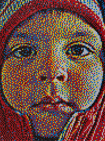
Eric Daigh’s artwork combines creativity along with hours of diligent application. As a process artist, his work starts with taking a series of photographs of his subject. After carefully analyzing the photos, he uses a computer and specialized software to break an image down to a very low resolution and forces the computer to make the image out of only five colors (red, blue, yellow, black and white).[3] He then uses a grid map to show where to stick the pins row by row. At first glance, Daigh’s artwork appears to be a low-resolution portrait, but upon closer inspection, onlookers can see each piece is made up of thousands of colored pins. Many of his art pieces use over 11,000 pushpins to complete a three-foot by four-foot piece and as many as 25,000 pushpins for a four-foot by six-foot piece.[4] In Summer 2010, Daigh surpassed his own world record by creating a commissioned pushpin piece for automaker Acura, which used 109,687 pushpins.[5]
So my question to you is this - if you do consider Eric Daigh's work art, what makes it that way? Is he a pure technician that came up with a great idea and ran with it - and if so - what impact does that have in judging it as art?

There are no definitive answers to this question, but I'm interested in your opinion. Check out this blog post to help inform your opinion.
-Denner

Monday, February 7, 2011

Monday History

Eduard Manet 
A Bar at the Folies-Bergere, 1882
Eduard Manet
This is one of my favorite paintings from this time period because of the expression in the subject's face; she has an ambivalent stare that pierces the viewer.  I love the way the mirror behind her tells most of the story but does not reflect in a true to life manner - look at how the reflection of the barmaid is off-set to the right.
    About Manet as described by Wikipedia.com
(January 1832 – 30 April 1883) was a French painter. One of the first 19th-century artists to approach modern-life subjects, he was a pivotal figure in the transition from Realism to Impressionism.
His early masterworks, The Luncheon on the Grass (Le déjeuner sur l'herbe) <-(Check this out!) and Olympia, engendered great controversy and served as rallying points for the young painters who would create Impressionism. Today, these are considered watershed paintings that mark the genesis of modern art.
IB 1 students - take some time to look carefully at the background and describe what you see as a response in your books. 

As always, keep your pencils sharp and your ideas fresh!